
The Digital Marketing Lessons Every Frontend Developer Should Steal
March 26, 2026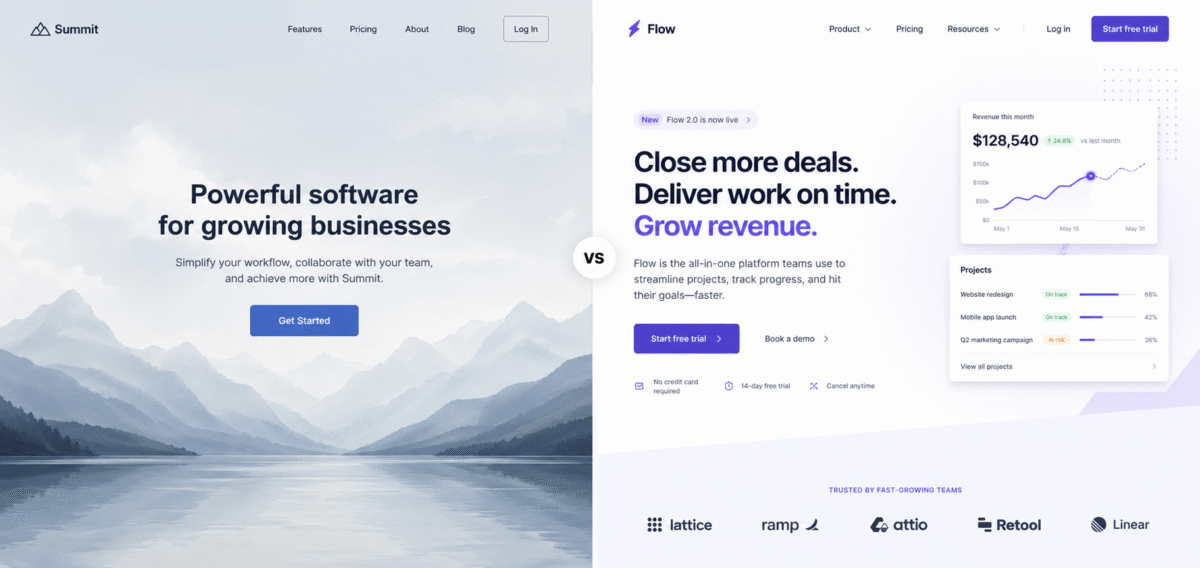
We’ve all built it.
The classic "Hero Section". A massive, high-resolution background image, a centered H1 tag, a subheadline, and a primary CTA button. It’s the industry standard. It’s safe. It’s also becoming one of the most effective ways to make a user bounce.
As a frontend developer, I used to love these. They’re easy to componentize, they look great in a portfolio, and they give off that "premium" vibe immediately. But as a digital marketer and designer, I’ve started to see the cracks.
The traditional hero section is dying because it’s often passive. It assumes the user wants to sit there and admire your photography. In reality, modern users are on a mission, and if your "above the fold" content is just a pretty roadblock, you're losing money.
Here is how I’ve stopped building "heroes" and started engineering entry points that actually drive action.
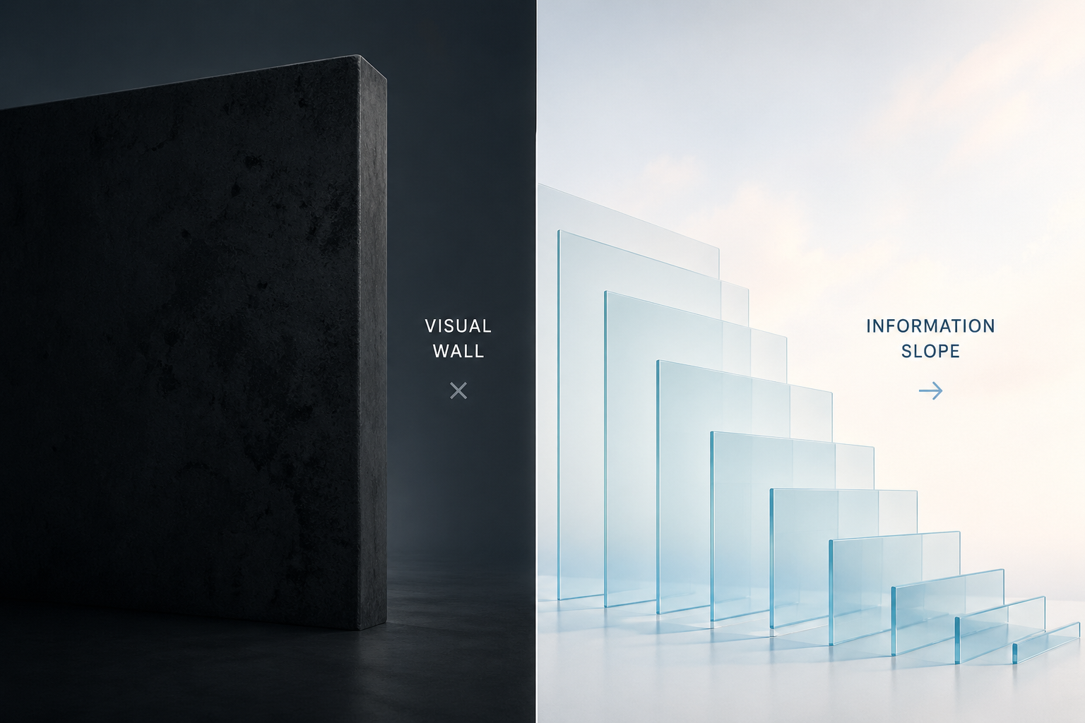
1. The "Visual Wall" vs. The Information Slope
The biggest problem with traditional hero sections is that they act like a wall. The user lands, sees a giant image, and stops. There’s no "scent of information" leading them further down the page.
Now, I focus on the Information Slope. I want the code and design to practically pull the user’s eyes downward.
How to engineer this:
- The Peek-a-Boo Technique: Ensure the next section of the site is partially visible (about 10–15%) at the bottom of the viewport on standard screen sizes. This signals to the brain that the story isn't over.
- The Asymmetric Layout: Move away from centered text. By placing content on a grid that leaves one side open, you create a visual imbalance that encourages scrolling to find "resolution."
2. Stop "Loading" and Start "Rendering Value"
We talk a lot about LCP (Largest Contentful Paint) in dev circles. But from a marketing perspective, a fast LCP on a giant, useless image is a waste of a performance budget.
If your hero image takes 1.2 seconds to load but doesn't explain the product, you’ve spent your performance capital on a decoration.
How to engineer this:
-
Prioritize Text over Pixels: Use CSS-heavy designs or SVG patterns that render instantly. A high-converting entry point often prioritizes a bold, clear value proposition that is readable before the heavy assets finish downloading.
-
Micro-Interactions over Static Images: Instead of a static JPEG, I’ve started using small, interactive UI snippets—like a "live" calculator or a mini-product demo—right in the entry point. It converts the user from a passive observer to an active participant within seconds.

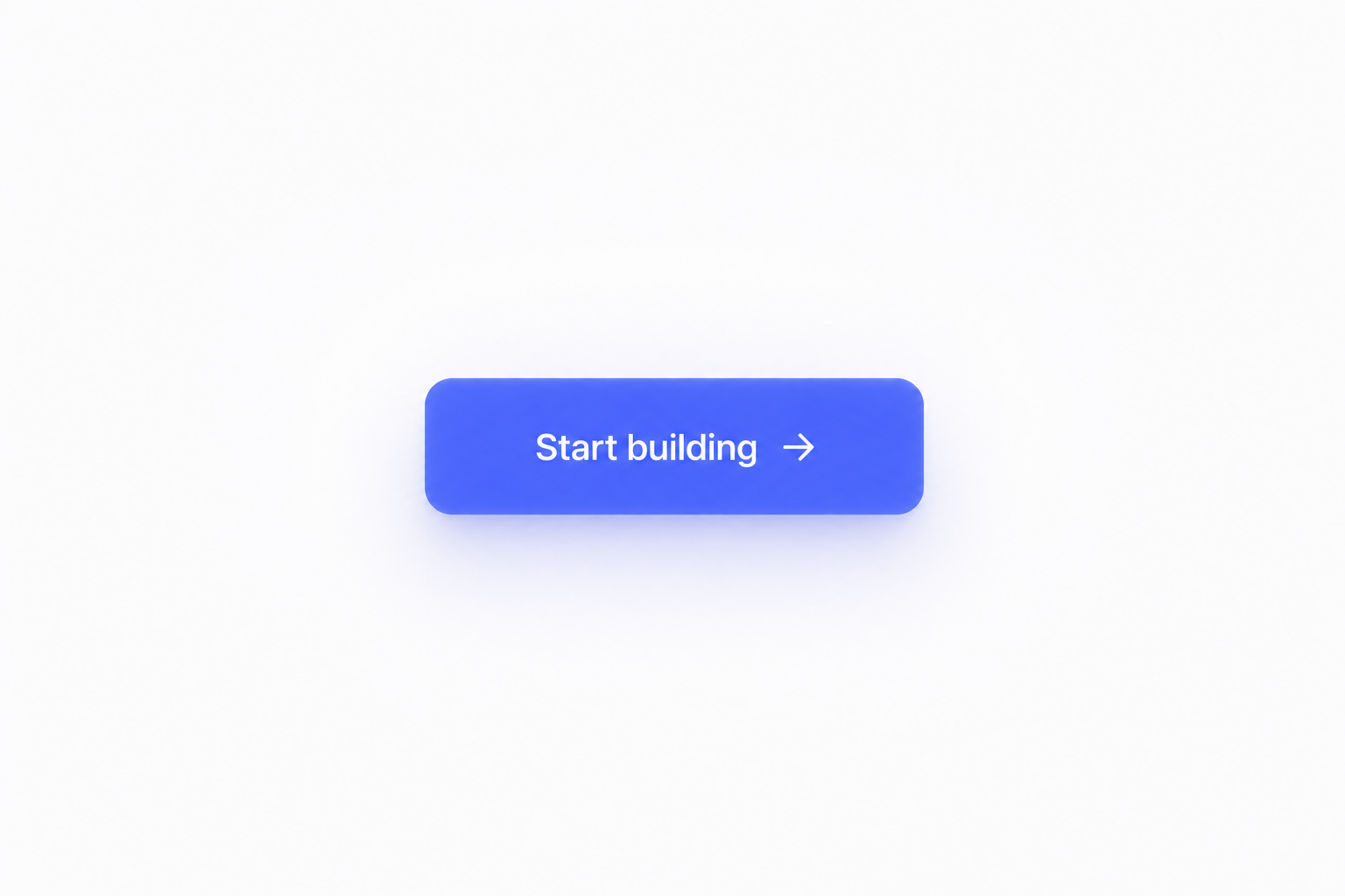
3. The Death of the "Generic" CTA
"Get Started." "Learn More." "Sign Up." These buttons are invisible. In the world of marketing, we call this "banner blindness".
When I’m building a frontend now, I treat the primary button as a functional extension of the headline. If the headline is the promise, the button is the delivery.
How to engineer this:
-
Dynamic CTAs: Use props to pass specific, high-intent labels to your buttons. Instead of "Get Started," try "Start My Free Trial" or "Build My First App."
-
Visual Priority: Use code to ensure the CTA is the most visually distinct element on the page. Test your contrast ratios not just for accessibility, but for "eye-tracking" dominance.
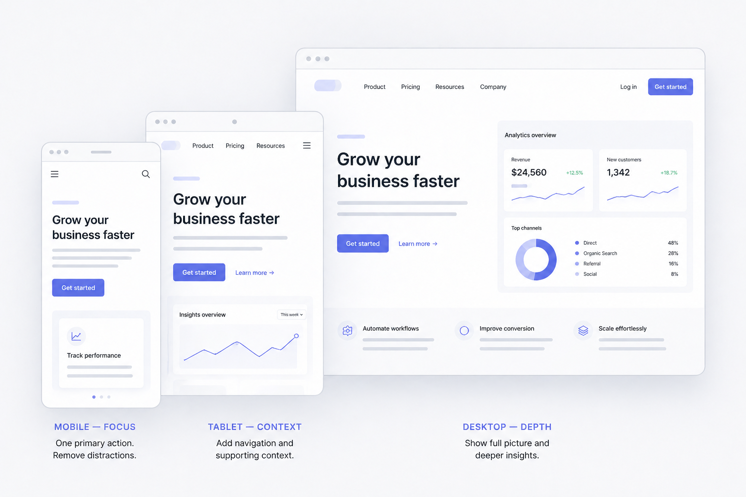
4. Designing for "Intent" Not just "Devices"
Usually, we think: "How does this hero look on iPhone 15 vs. Desktop?" Now I think: "How does this look for a user coming from a Google Search vs. a user coming from a LinkedIn post?"
The entry point should adapt to the user's intent. Someone coming from a technical search wants a different entry point than someone coming from a lifestyle ad.
How to engineer this:
- Conditional Rendering: Use URL parameters to swap out hero content. If
?source=tech_blog, show a code-focused entry point. If?source=social, show a benefit-focused entry point. - The "Mobile-First" Truth: On mobile, the "Hero Image" usually just pushes the important text off the screen. If your mobile view is 70% image and 30% text, you're failing the marketing test. Flip those proportions.
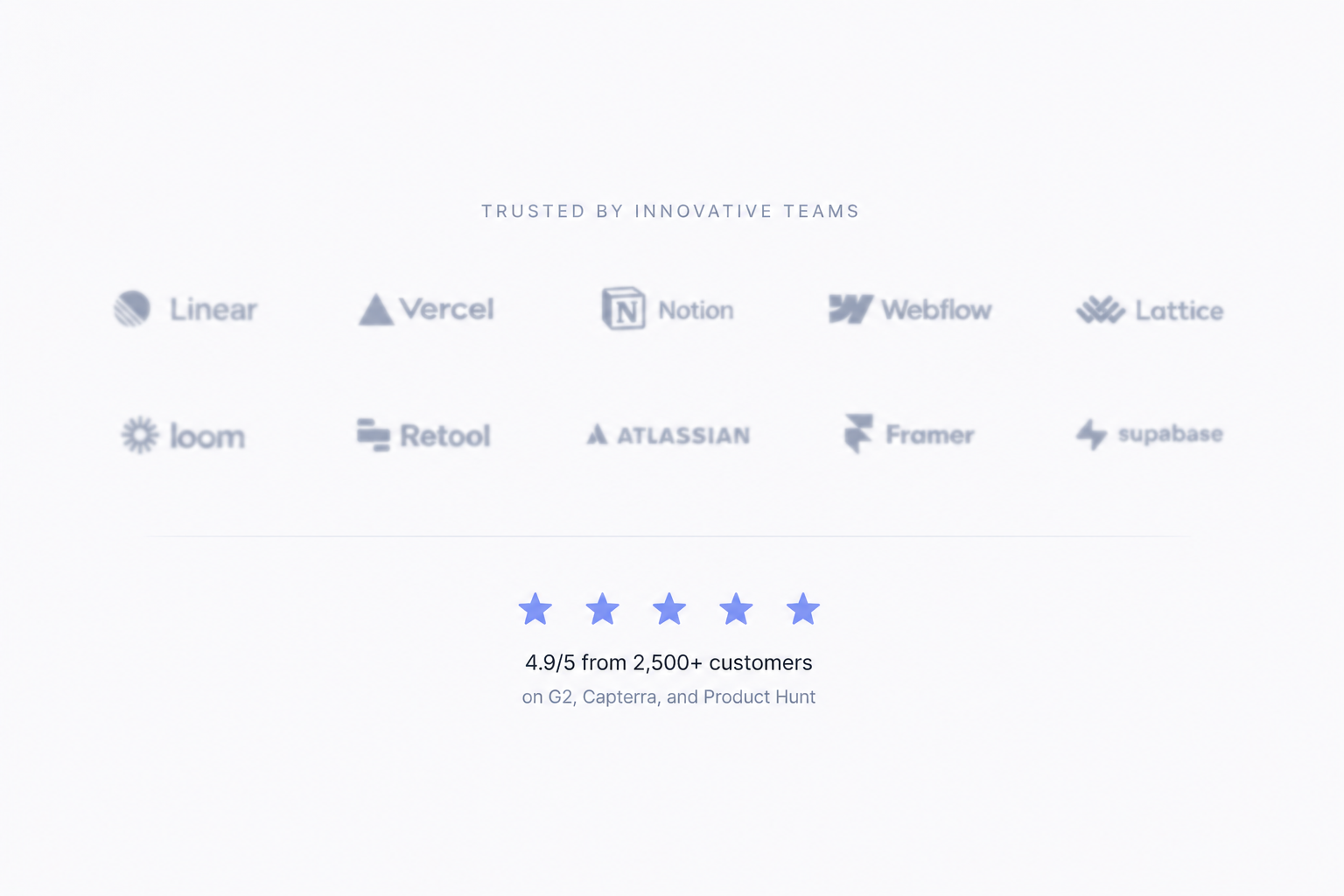
5. Social Proof is Part of the Architecture
A hero section that only talks about "us" is a missed opportunity. Trust is the hardest thing to build online, and it needs to happen the moment the page loads.
I’ve started integrating social proof-logos, "Trusted by 5,000+," or star ratings—directly into the entry point component, rather than hiding it three sections down.
How to engineer this:
-
The "Trust Bar" Component: Build a reusable, lightweight logo cloud or testimonial ticker that lives immediately under the main headline.
-
Real-time Data: Use APIs to show live stats (e.g., "12 people joined today"). It adds a layer of technical sophistication and immediate marketing credibility.
The New Standard
The "Hero Section" isn't just a design choice anymore; it’s a technical challenge. Our job as developers isn't just to make it look like the Figma file. Our job is to ensure that the moment a user hits our URL, the code handles the psychological transition from "Stranger" to "Customer."
The next time you're about to drop a massive <div> with a background image at the top of your index.html, ask yourself: Is this a hero, or is it a barrier?
Are you still using the traditional hero layout, or have you found a more modern way to hook your users? Let's talk about it in the comments.
