The Smallest Billboard You Own: Designing for the Browser Tab
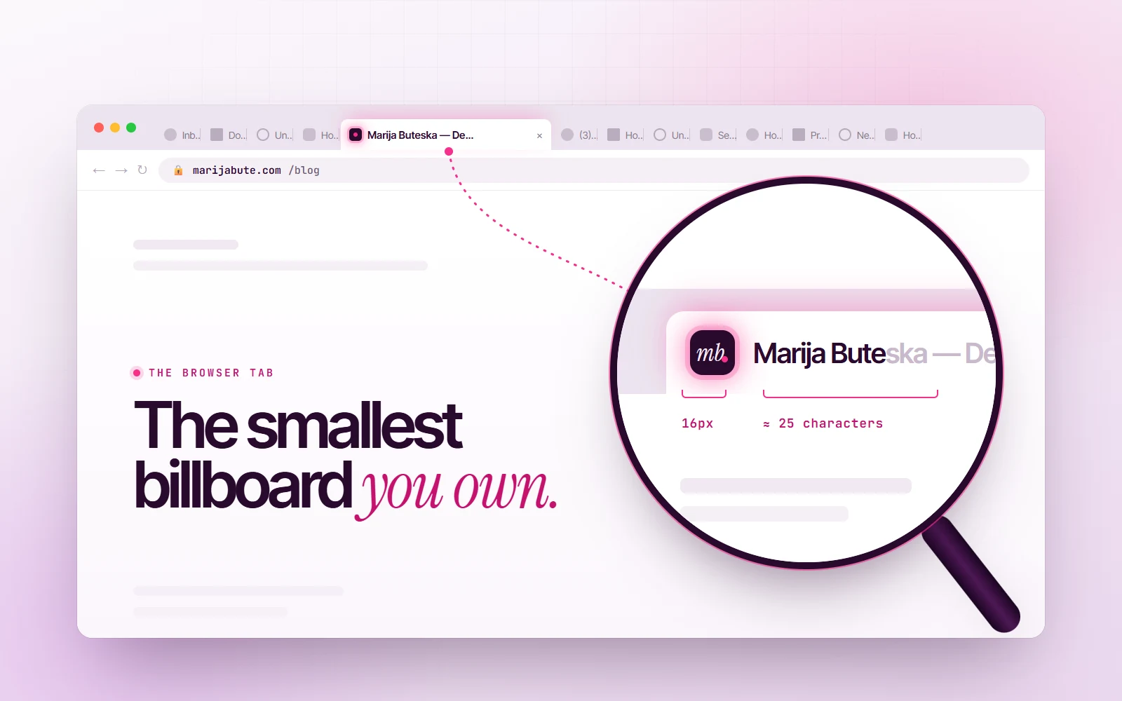
Your website spends most of its life squeezed into 16 pixels and about 25 characters, sitting between 40 other tabs. Here's how to design for the space nobody designs for.
Count the tabs you have open right now. Go on.
If you’re like most people I know, the answer is somewhere between “too many” and “I’m scared to look.” And somewhere in that row of tiny shapes is a website someone spent months designing: the hero, the scroll animations, the perfect type scale. None of it is visible. What’s left is a 16-pixel icon and whatever fits of the title before the browser cuts it off.
That strip is the smallest billboard your brand owns. It’s also the one that’s on screen the longest. A visitor might spend forty seconds on your homepage, but your tab can sit in their browser for three days, quietly reminding them you exist, or quietly losing them in a row of identical grey globes.
As a designer, I’d never been taught to design it. As a front-end developer, I’d treated it as an afterthought: drop in a favicon, set a title, ship. As a marketer, I eventually realised it’s the one placement I get for free, on every single visit. So I started treating it like a real design surface. Here’s what I’ve learned.
1. You have about 25 characters. Spend them in the right order.
When a browser fills up with tabs, titles shrink fast. On a laptop with a dozen tabs open, you’ll see maybe 20–25 characters before the ellipsis. With thirty tabs, you might only see the favicon.
Most sites write titles like this:
Home | Acme Creative Studio · Branding, Web Design & MarketingIn a crowded tab bar, that becomes “Home | Acme Creat…”. The most useless word on the page got the best seat.
The fix is simple: put the most distinguishing words first. For a page someone is actively using, that’s what the page is. For the homepage, it’s who you are.
Pricing · Acme
Brand identity for a winery · Acme
Acme · Branding & web design studio
The rule I use: if the user had only the first three words, could they find this tab again? Bonus: search engines show roughly the first 60 characters of the same title in results, so front-loading the meaning helps there too.
2. Design the favicon for 16 pixels, not for your logo file
A favicon isn’t a tiny logo. It’s a separate design problem. Your full logo, scaled down to 16×16, turns into a smudge. The best favicons are reduced to one bold, recognisable shape: a letter, a mark, a single strong colour.
Three things I check every time:
- Squint test. Shrink it to 16px and look at it from across the room. If you can’t tell what it is, nobody can.
- Light and dark tab bars. A dark-navy icon disappears on a dark browser theme. A white one disappears on a light theme.
- The neighbours. Put a screenshot of it in a row next to Gmail, Figma, YouTube and Notion. Does it hold its own, or does it look like a broken image?
The second point has a lovely modern solution: SVG favicons can respond to dark mode on their own, because you can put a media query inside the SVG.
<link rel="icon" href="/favicon.svg" type="image/svg+xml" />
<link rel="icon" href="/favicon.ico" sizes="32x32" /> <!-- fallback --><svg xmlns="http://www.w3.org/2000/svg" viewBox="0 0 32 32">
<style>
.mark { fill: #2A0A2E; }
@media (prefers-color-scheme: dark) {
.mark { fill: #FBF8FC; }
}
</style>
<rect class="mark" x="4" y="4" width="24" height="24" rx="7" />
</svg>One file, crisp at every size, and it never vanishes into the browser chrome.
3. The tab is a notification channel. Use it like one.
The “(3)” in front of your inbox’s title is one of the most effective UI patterns ever made. It works because it’s honest: something new is waiting for you.
If your product has anything genuinely new for the user (messages, a finished export, an order status), the tab is the perfect, polite place to say so:
const base = "Inbox · Acme";
function setUnread(count) {
  document.title = count > 0 ? `(${count}) ${base}` : base;
}
You can go a step further and draw a small dot onto the favicon with a canvas, the way chat apps do. But the key word is genuinely. A badge that lights up for “news” nobody asked for teaches people to ignore you, or to close the tab.
4. The “come back” trick, and how not to be annoying about it
You’ve probably seen this: you switch to another tab, and the one you left changes its title to something like “Hey, come back! 👋”. It uses the Page Visibility API:
const original = document.title;
document.addEventListener("visibilitychange", () => {
  document.title = document.hidden ? "Your cart misses you" : original;
});
Used well, it’s charming. An e-commerce site that gently reminds you about a half-finished checkout is doing you a favour. Used badly, it’s a needy pop-up in disguise.
My rules for it:
- Only when there’s a real reason: an unfinished form, an item in the cart, a video paused halfway.
- Never animate it. A flashing, scrolling tab title is the 2026 version of the blinking banner ad.
- Always restore the real title the moment the user comes back, and keep the page name visible so they can still find the tab.
5. Mobile has a tab too: it’s the browser colour
On phones there’s barely a tab bar, but there is the browser’s address bar, and you get to colour it. One meta tag makes the whole browser feel like part of your site instead of a grey frame around it:
<meta name="theme-color" content="#FBF8FC" media="(prefers-color-scheme: light)" />
<meta name="theme-color" content="#2A0A2E" media="(prefers-color-scheme: dark)" />
It’s a tiny detail, and that’s exactly why people notice it. The site suddenly feels finished.
6. The tab’s twin: the link preview
There’s one more place your site shows up as a tiny card: when someone pastes your link into WhatsApp, Slack, LinkedIn or iMessage. That preview is built from your Open Graph tags, and if they’re missing, your beautiful work gets shared as a bare grey URL.
<meta property="og:title" content="Brand identity for a winery · Acme" />
<meta property="og:description" content="One scroll turns a grape into a signed bottle." />
<meta property="og:image" content="https://acme.studio/og/winery.jpg" />
<meta name="twitter:card" content="summary_large_image" />
Treat the preview image like a mini poster: big, simple, readable at thumbnail size. It’s often the first time someone ever sees your brand, before they’ve even clicked.
The 10-minute tab audit
Open your own website, then open fifteen other tabs next to it. Now check:
- Can you find your tab instantly? If not, the favicon needs more contrast or a bolder shape.
- Read your title truncated. Do the first three words still say something useful?
- Switch your OS to dark mode. Does the favicon survive?
- Open the site on your phone. Does the browser bar match your brand?
- Paste your link into a chat. Is there a real preview, with an image?
- Check every important page, not just the homepage. “Untitled” and “Home” are still shockingly common.
None of this takes more than an afternoon, and none of it shows up in a portfolio screenshot. But it’s the part of your website people see the most, for the longest, in the busiest place on their screen.
Design the billboard. It’s already paid for.