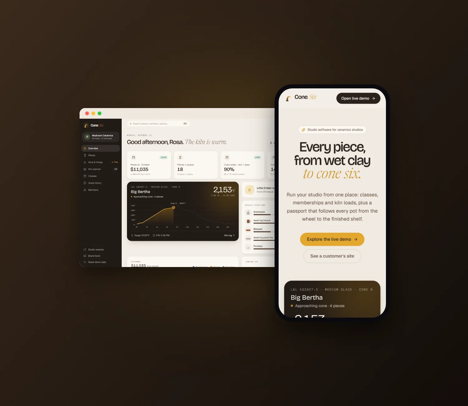
FORMA: Studio OS for Creative Teams
A complete product for design studios, freelancers and small agencies, designed and built end to end: the brand, a marketing site with a working demo in the hero, a brand book, the studio app, and a client portal white-labelled for four fictional clients. All of it runs on one shared data layer. Clients click the exact point they mean (“make this smaller”), and every comment stays pinned to that spot on that version.
- Role
- Brand, product design & development
- Scope
- Identity, marketing site, web app, client portal, reporting
- Stack
- React 19, TypeScript, Tailwind v4, Motion, dnd-kit, Zustand
- Type
- Archivo, Fraunces, Inter Tight, JetBrains Mono
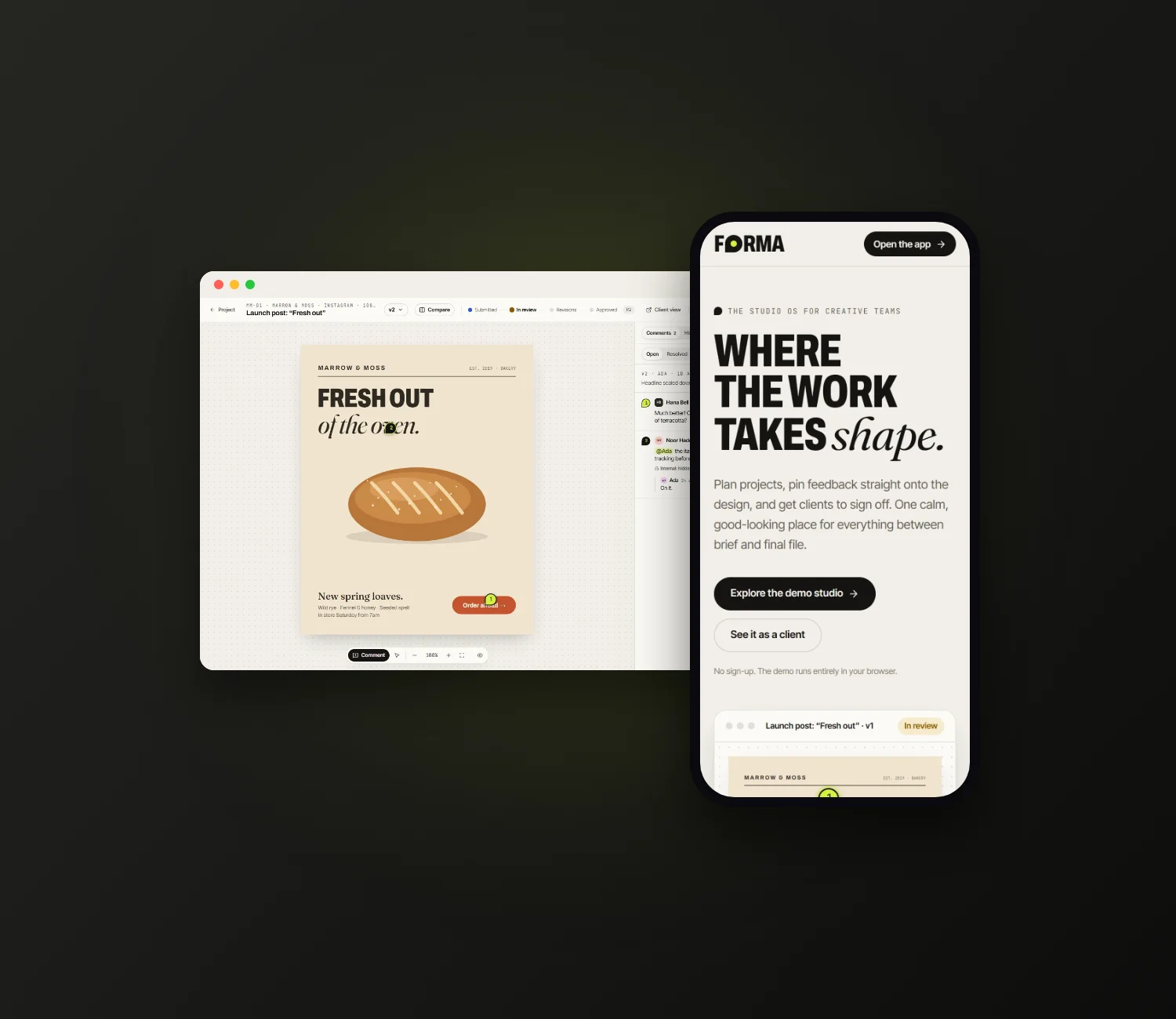
Live The real product, running here. Click anywhere on the design in the hero to pin a comment, then open the studio, the client portal or the brand book. The studio, clients and people are fictional demo content.
The problem
Feedback that arrives as a screenshot with a red circle.
Most studios run on four tools that don't talk to each other: a task board, a file-sharing link, an email thread with the client and a spreadsheet for hours. Feedback is where it hurts most.
Notes arrive as screenshots with red circles, vague requests like “the thing at the top” and replies on the wrong version. The approval itself gets buried in an email that someone has to dig up again three months later.
What studios need
- Feedback anchored to the design
- One clear approval trail
- Client and internal talk kept apart
- Plans that respect dependencies
- Honest project health
- A portal clients enjoy using
Creative feedback is spatial: this word, that corner, the blue behind her. So the core object in FORMA isn't a message in a thread, it's a pin on a point.
The brand
A shape you can approve.
- 01
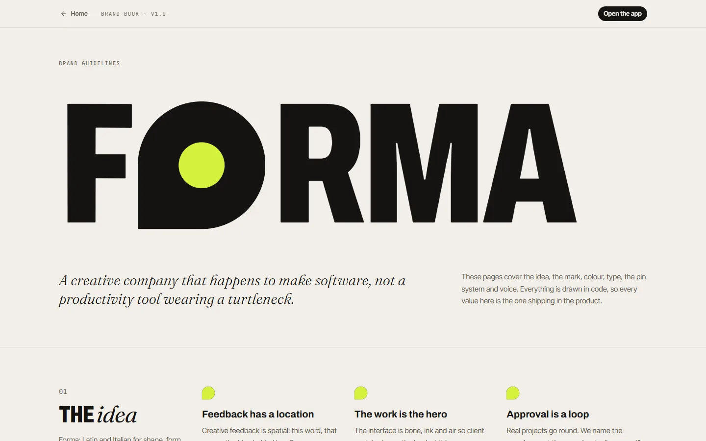
The name
Forma is Latin and Italian for shape: the moment loose ideas become something a client can sign off.
- 02
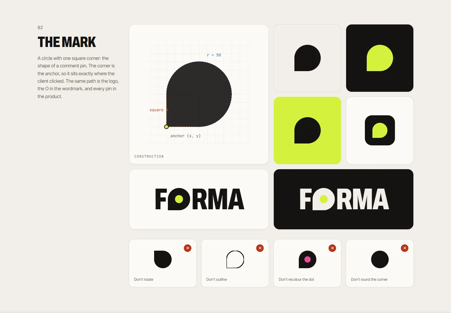
The mark
A circle with one square corner, the shape of a comment pin. The corner is the anchor, so it sits exactly where the client clicked.
- 03
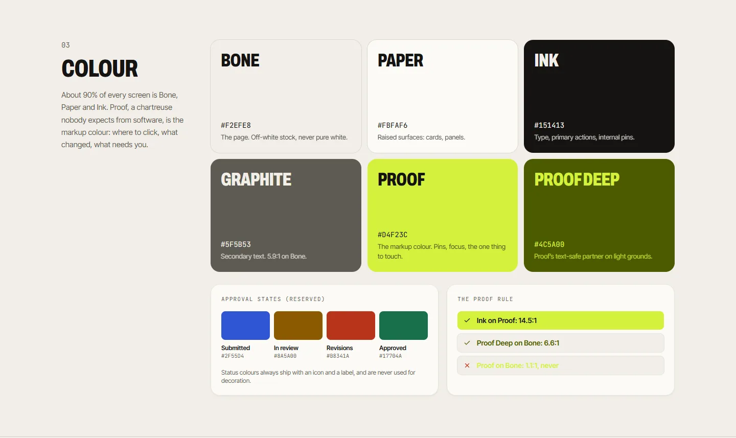
Colour
Bone and Ink carry about 90% of every screen, so the client's work is always the loudest thing. Proof, a chartreuse, marks what to touch.
- 04
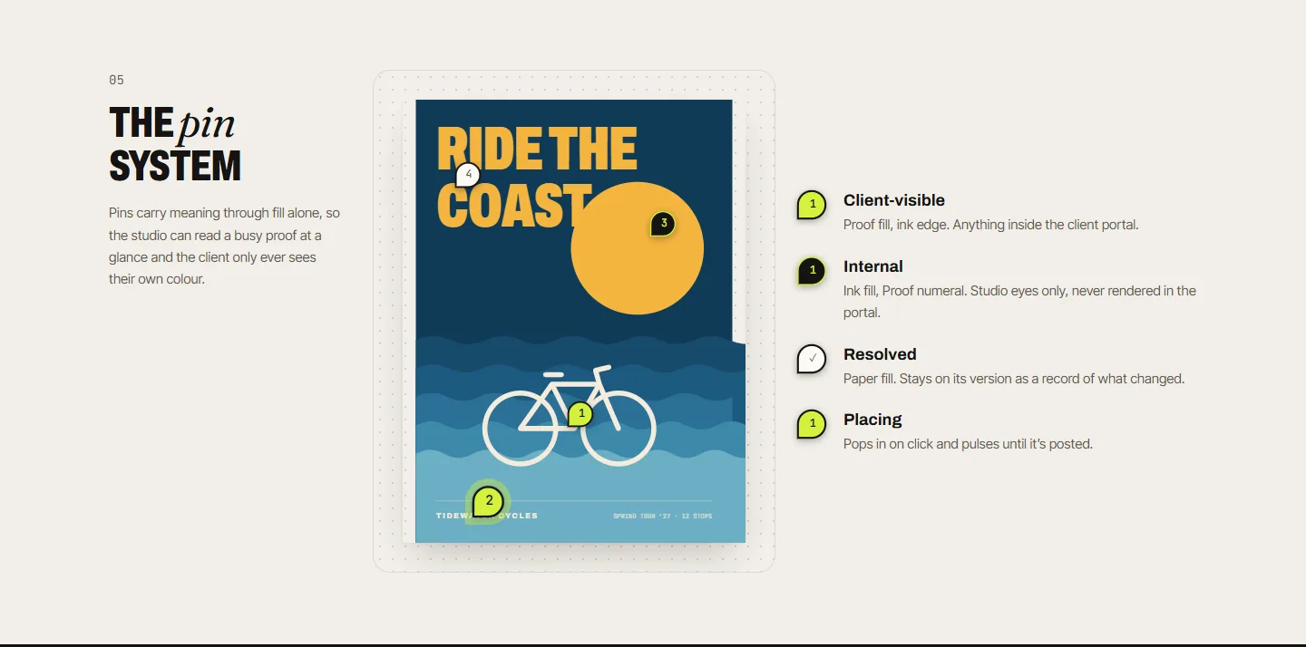
The pin system
Client, internal, resolved and placing pins differ by fill alone, so a busy proof reads at a glance.
One path is the logo, the O in the wordmark, the favicon and every pin in the product. Everything is drawn in code, so each value in the brand book is the one shipping in the app.
Color
Bone, Ink and one unexpected chartreuse
Typography
Condensed confidence, one human word
MAKE IT
Aa Bb Cc Dd Ee Ff Gg 0123456789
approved.
Aa Bb Cc Dd Ee Ff Gg 0123456789
Request revisions
Aa Bb Cc Dd Ee Ff Gg 0123456789
v3 · R2 · 12.5h
Aa Bb Cc Dd Ee Ff Gg 0123456789
Visual proofing
Click the exact pixel you mean.
Pins are stored as fractions of the artwork (0 to 1), so they stay accurate at any zoom level and on any screen. Each pin is anchored by its square corner, can be dragged by its author, and is linked both ways with the thread list: hover a pin to highlight its thread, click a thread to scroll the canvas to its pin.
Versions can be compared side by side with each version's pins, with a swipe slider, or as an opacity overlay. The seeded designs are drawn in code, so v1 → v2 shows the actual feedback applied. Uploaded files are stored in IndexedDB, because a high-resolution export won't fit in localStorage.
In the viewer
- Pins anchored by their corner
- Two-way pin ↔ thread linking
- @mentions with deep links
- Zoom, select and comment modes
- Side-by-side, swipe & overlay compare
- Full version history
One proof, two audiences
The studio sees everything. The client sees what's theirs.
- 01
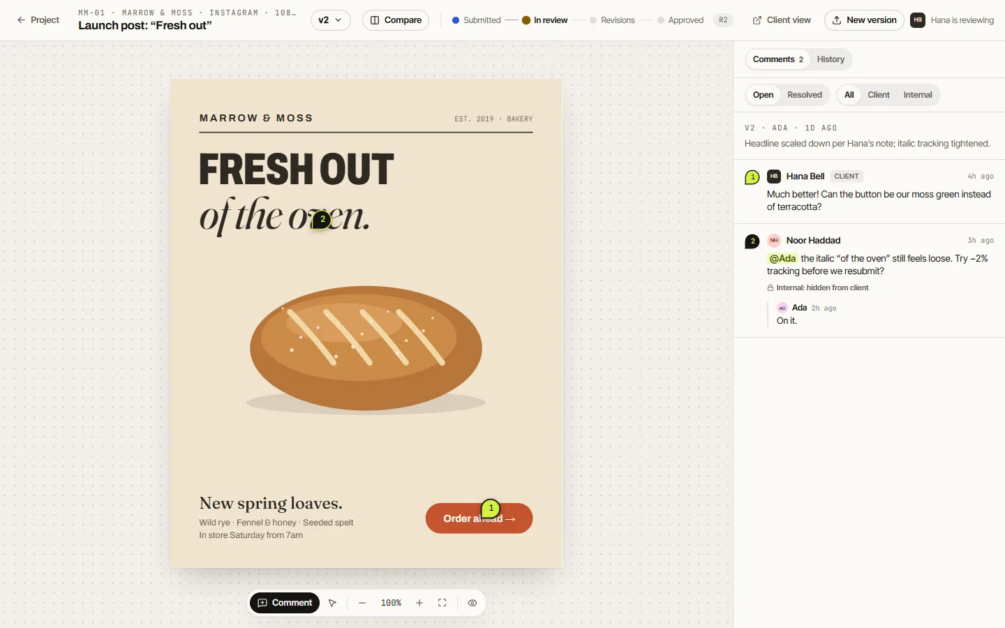
Studio view
Two pins: the client's request, and an internal note to Ada about the italic, marked “hidden from client”.
- 02
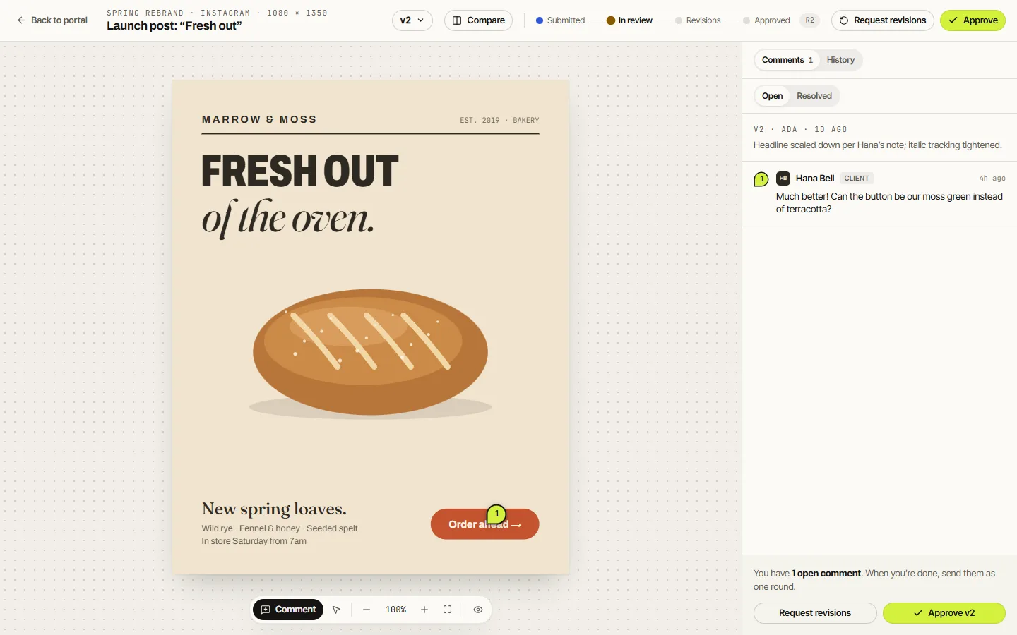
Client view
The same proof in Marrow & Moss's portal. The internal pin is gone, and the numbering is recounted so it leaves no gap.
- 03
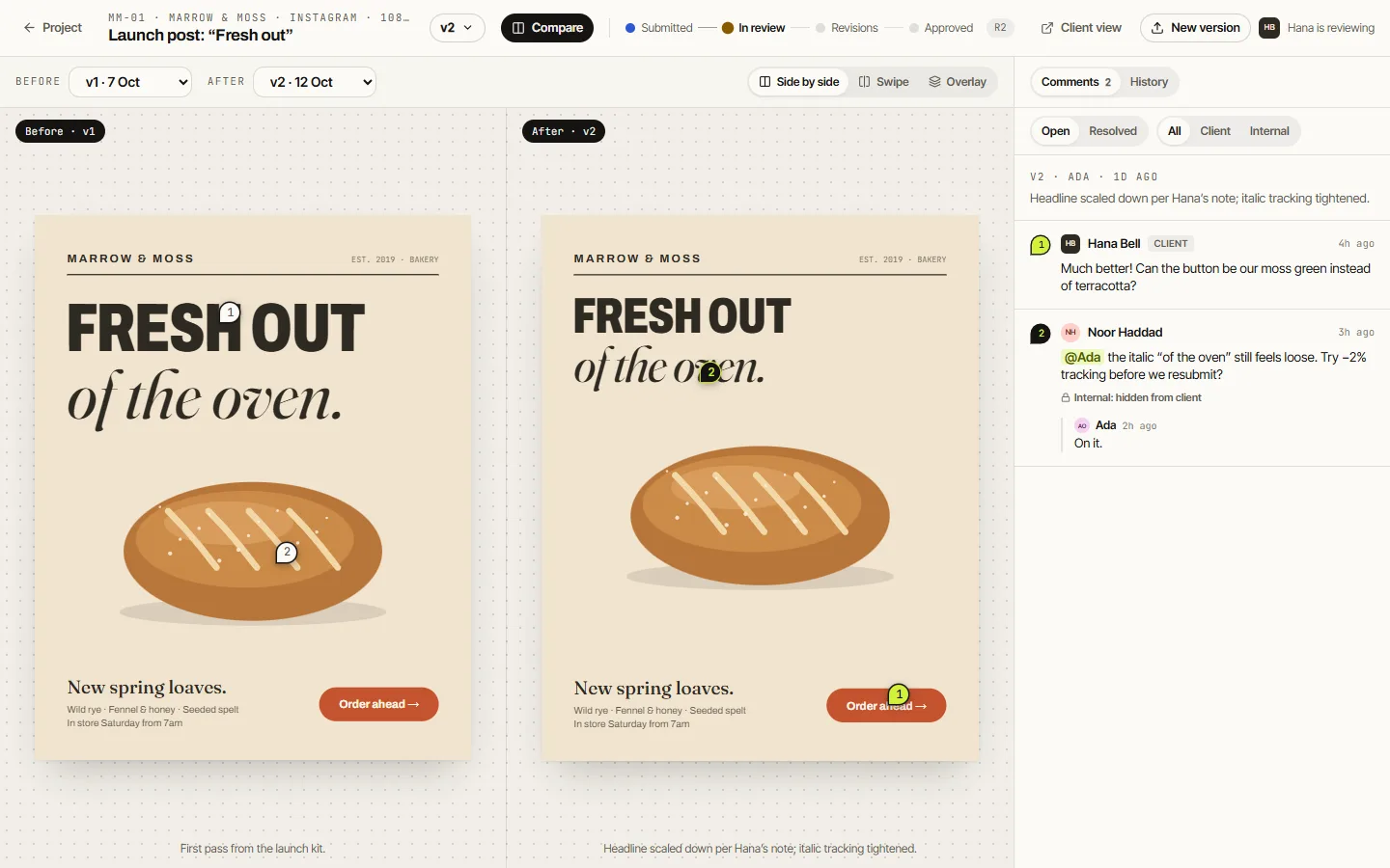
Compare
v1 and v2 side by side, each with its own pins: the headline was scaled down exactly as Hana asked.
Every pin and update is either internal or client-visible. The portal filters the data itself, not just the interface, and only shows versions that were actually sent to the client.
Approvals
Approval is a loop, and every turn is on record.
Each proof moves through a clear state machine: draft → submitted → in review → changes requested ↺ → approved. When a client opens a submitted proof in their portal, it moves into review and the studio is notified. Requesting revisions bundles all open comments into one round.
Rounds are counted and shown as R1, R2 and so on, and every transition is logged with who, when, which version and an optional note. Months later, “who approved this?” takes one click to answer.
The studio app
Everything between brief and final file.
- 01
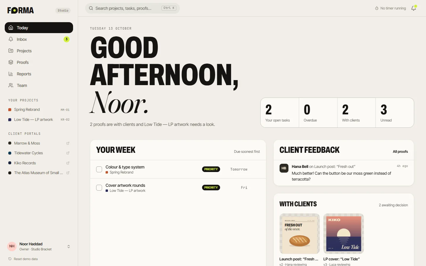
Today
Your week, what clients said, and which proofs are waiting on a decision.
- 02
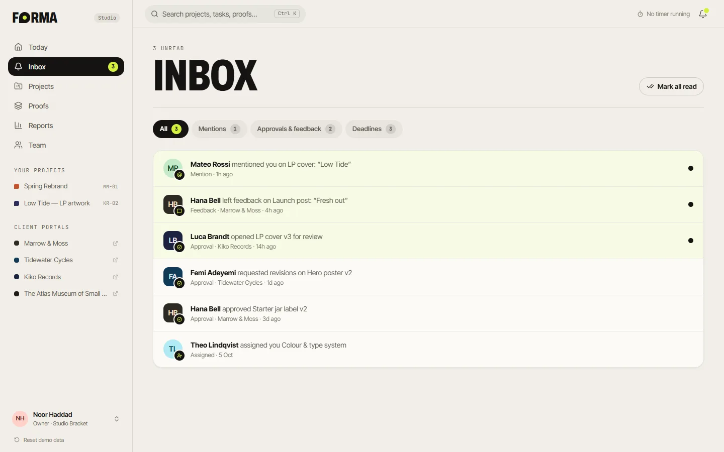
Inbox
Mentions, feedback, approvals and deadlines, routed to exactly the right people.
- 03
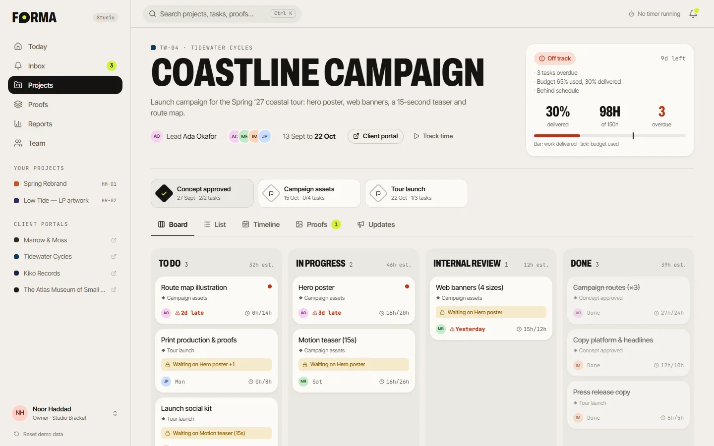
Board
A kanban that refuses to mark work done while anything it depends on is still open.
- 04
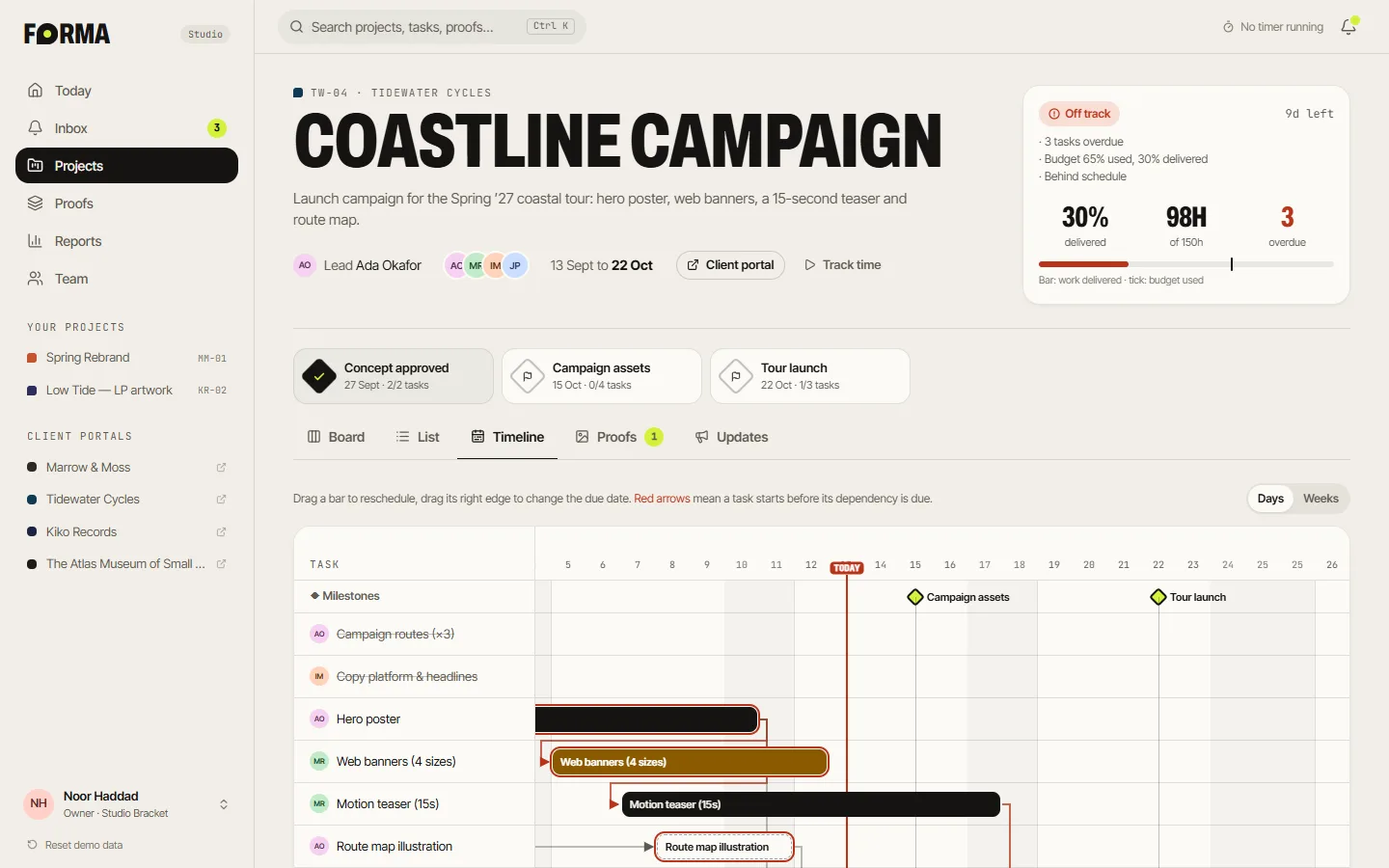
Timeline
A draggable Gantt with milestones, a today line and arrows that turn red on conflicts.
- 05
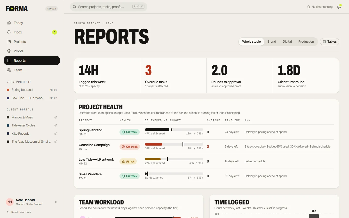
Reports
Project health that explains itself: “Budget 65% used, 30% delivered.”
- 06
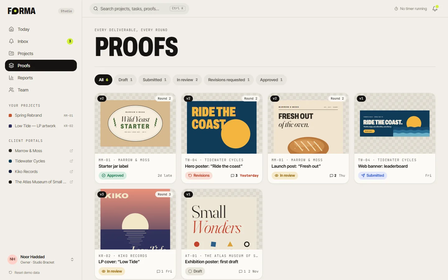
Proofs
Every proof across every client, with its state and round at a glance.
On the Coastline Campaign board, try dragging Print production to Done: it refuses, because the poster it depends on isn't finished yet.
Under the hood
Small rules that make a studio feel calm.
Project health compares overdue work, budget burn against delivered work and schedule elapsed, and always says why. Workload spreads each task's remaining hours across its window over the next 14 days and compares it to each person's capacity. Dependencies are checked for cycles, and deadlines are calculated live, so they're never stale.
Four roles (owner, admin, member and guest) map to capabilities, with the client as a fifth audience. A persona switcher lets you watch the app change: as a guest, Reports disappear and you can only edit your own tasks. And the voice sounds like a good studio producer: “Can't finish yet: waiting on ‘Route map illustration’”, not “Dependency constraint violated”.
System
- Approval state machine with full log
- Dependency & cycle checks
- Explained project health
- 14-day workload vs capacity
- Role-based permissions
- Smart notification routing
White-label portal
A portal in their colours, not ours.
Each client gets a portal styled in their own brand. They see progress, proofs and updates, approve or request revisions in a couple of clicks, and never see the studio's internal threads. FORMA stays quietly in the footer: “Powered by FORMA.”
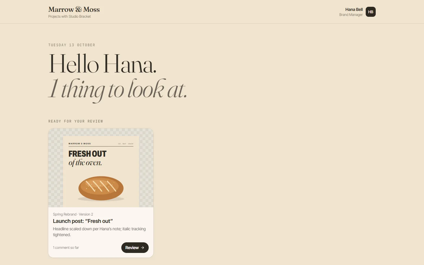
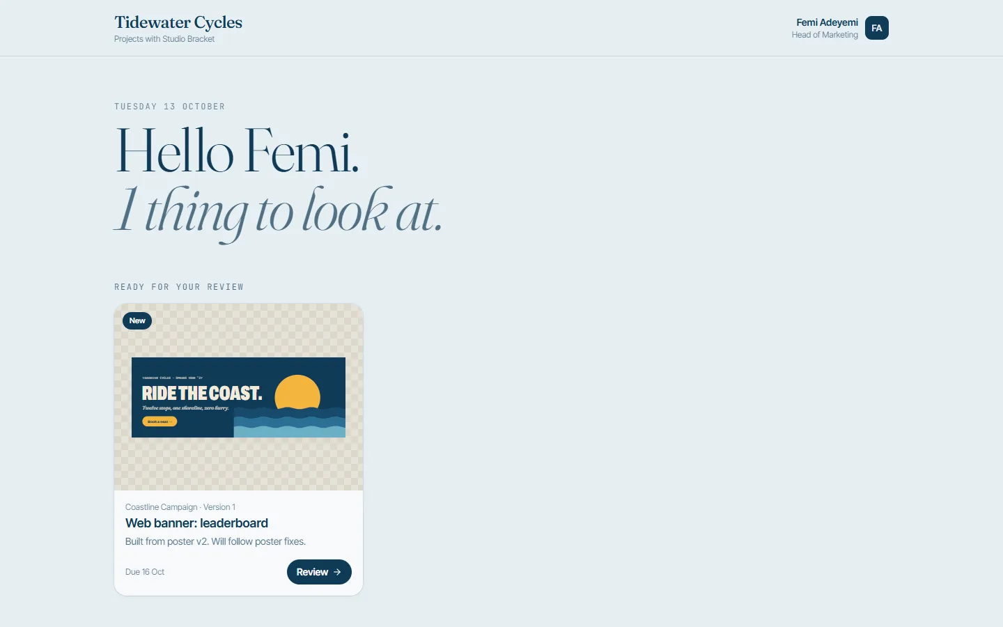
Two clients, two portals: Marrow & Moss in warm bakery tones, Tidewater Cycles in coastal blues. Same data, same flow.
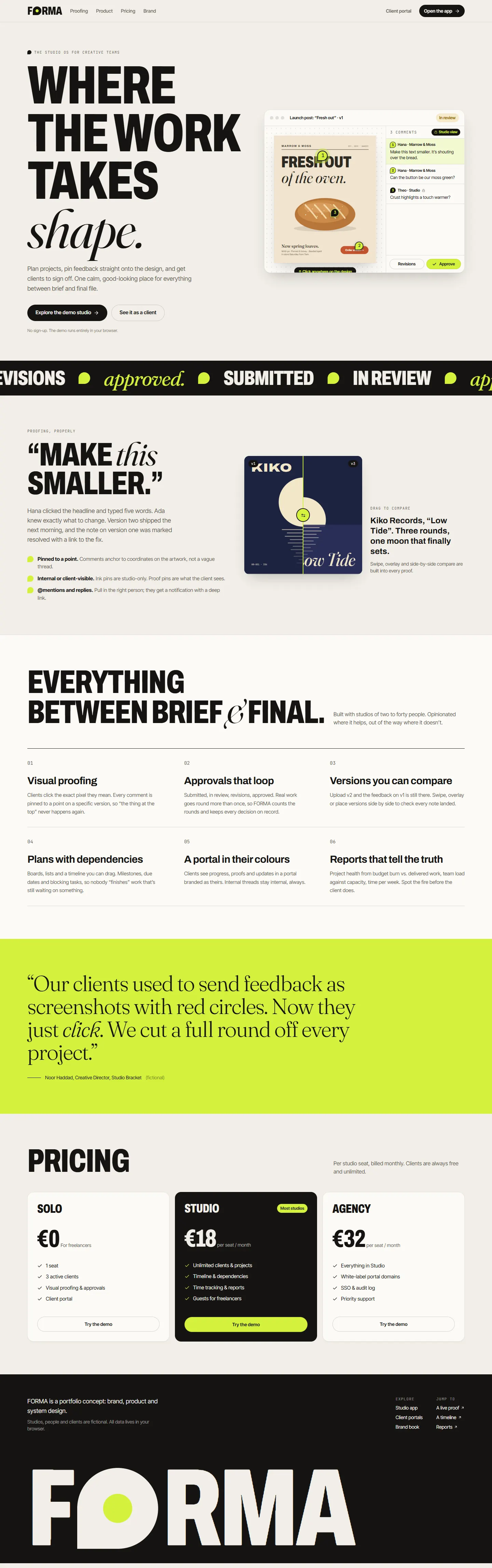
The marketing site: a working proofing demo in the hero, the approval states as a ticker, features, a studio's story and pricing.

Designed for every screen, including proofing on a phone, where the thread list moves below the artwork.