Color Psychology in UI: Design How It Feels, Not Just How It Looks
You feel a color before you read a single word. Here's what I learned giving every mood in Vibetunes its own palette, and how to use color psychology in your own interface without getting it wrong.
Open an app and, before you’ve read a single word, you already have an opinion about it. Calm or urgent. Warm or cold. Playful or serious. Trustworthy, or something you want to close.
That first impression comes from color. Not the copy, not the features, not the clever micro-interaction you spent a week on. Color gets there first, and it quietly shapes how everything after it is read.
I got to test this properly while building Vibetunes, a mood-based music app. You tell it how you feel, and it builds a playlist for that moment. Early on I realised the playlist wasn’t the only thing that should match your mood. The whole interface should.
So I gave every mood its own visual identity, and kept everything else exactly the same.
Same screen. Different feeling.
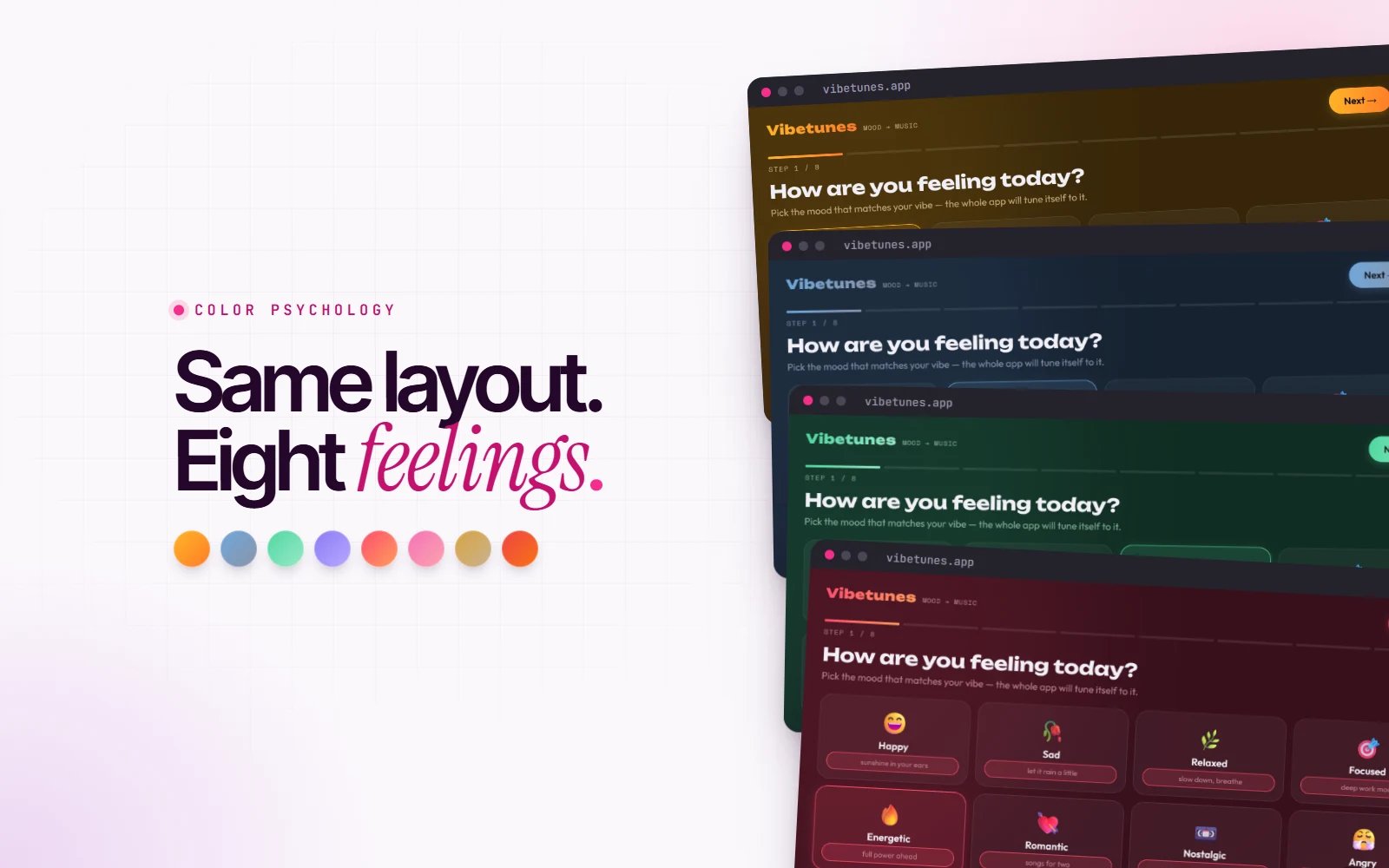
Vibetunes has eight moods: happy, sad, relaxed, focused, energetic, romantic, nostalgic and angry. Every one of them uses the same layout, the same type, the same components and the same spacing. Only the color changes.
And it’s enough. Put the eight screens side by side and they don’t look like one app with eight themes. They feel like eight different experiences. The yellow screen feels like it’s smiling at you. The blue one feels like it’s sitting next to you, quietly. Nothing else moved.
That’s the whole idea of color psychology in UI in one sentence: you feel the color before you read the words.
What color actually does
A quick, honest note before the palettes. Color psychology isn’t a set of fixed laws. “Blue means trust” and “red means danger” are associations, and associations depend on culture, context and personal experience. Red is a warning on a form, a celebration in China, and an appetite trigger on a pizza menu.
What is consistent are a few properties that work underneath the associations:
- Temperature. Warm hues (yellow, orange, red) feel closer, louder and more active. Cool hues (blue, green, violet) feel calmer and further away.
- Saturation. Vivid colors raise the energy of a screen. Muted, greyed colors lower it. This is often more important than the hue itself.
- Lightness. Bright feels open and light. Deep and dark feels focused, intimate or heavy.
When you design with color, you’re mostly turning these three dials. The hue sets the mood. Saturation and lightness set how loudly it speaks.
The moods, one by one
Here’s how that played out in Vibetunes. Each mood has an accent color and a second color it fades into.
Happy: sunshine in your ears
#FFB627 into #FF7A29
Warm, saturated yellow reads as light and optimism. It lifts the energy of the whole screen. I pushed it toward orange in the gradient so it feels like late afternoon sun rather than a highlighter pen.
Sad: let it rain a little
#6FA8DC into #8B93A7
This was the most interesting one to design. The instinct is to cheer a sad user up with something bright. But that feels dismissive, like someone telling you to smile. Muted blue lowers the energy instead. It sits with the feeling rather than trying to fix it, and that’s what makes it feel understood.
Relaxed: slow down, breathe
#4ED8A0 into #9BE8C9
Green reads as nature and rest. Soft, cool tones slow the eye down, and the breath with it. The second color is almost mint: very light, very low pressure.
Energetic: full power ahead
#FF4D6D into #FF9E5E
Hot, saturated colors feel fast. Pink-red into orange pushes the pace and keeps the energy up. This is the loudest palette in the app, on purpose.
And the other four
- Focused: violet,
#8B7CF6into#B7A8FF. Cool and steady, so it doesn’t compete with what you’re doing. - Romantic: pink,
#F472B6into#FDA4AF. Soft and warm, close rather than loud. - Nostalgic: amber,
#D9A441into#C9B291. Desaturated gold, like an old photo. - Angry: red into orange,
#EF4444into#F97316. It doesn’t try to calm you down. It turns it up, so you can let it out.
It doesn’t stop at the palette
Color does the heavy lifting, but a feeling falls apart if the rest of the interface disagrees with it. A calm blue screen with bouncy, frantic animations feels wrong, even if you can’t say why.
So in Vibetunes, the animations, emojis and micro-interactions follow the same emotion as the color. The glow behind the screen, the way elements settle in, the little emoji bursts when you pick a mood: they all match the palette. The interface doesn’t just change color. It changes temperament.
The engineering: one attribute, every color
Here’s the part I enjoy most as a developer. The psychology only works if the system is built for it. If every component had its own hard-coded colors, eight moods would mean eight copies of every style. Nobody maintains that.
Instead, every color in Vibetunes reads from the same handful of CSS custom properties. Each mood just gives those properties different values:
body {
  --bg: #0e0d12;
  --accent: #b9a8ff;
  --accent-2: #7ee0c3;
  background: var(--bg);
  transition: background 0.9s ease;
}

body[data-mood="happy"] {
  --bg: #191104;
  --accent: #ffb627;
  --accent-2: #ff7a29;
}

body[data-mood="sad"] {
  --bg: #090e18;
  --accent: #6fa8dc;
  --accent-2: #8b93a7;
}
Buttons, borders, progress bars, the glow, the headings: they all use var(--accent) and friends. None of them know which mood is active, and they don’t need to.
Then switching the whole app’s mood is a single line of JavaScript:
document.body.dataset.mood = mood;One attribute changes and the entire interface re-colors itself. The transition on the background makes it melt from one mood into the next instead of snapping, which matters more than you’d think. A sudden color change feels like a glitch. A slow one feels like a change of atmosphere.
This is the same principle behind every good dark mode or white-label product: design tokens. Decide what each color means (background, accent, muted text), name it, and let the values change underneath.
Don’t let the feeling break the basics
Designing for emotion doesn’t mean you get to skip accessibility. A few rules I kept for every mood:
- Contrast still has to pass. Every palette has to keep text readable against its own background. Aim for WCAG AA: at least 4.5:1 for body text. Check each theme separately, because a color that works on dark blue can fail on dark amber.
- Color is never the only signal. The selected mood also gets a stronger border, a glow and a little bounce of its emoji, so people who can’t tell the colors apart still know what’s chosen.
- Respect reduced motion. If someone has turned on reduced motion in their system settings, the animations that carry the feeling should calm down too.
How to use this in your own product
You don’t need eight moods to use any of this. A normal website has one feeling, and it’s worth choosing it on purpose.
- Decide the feeling first, then the color. Write down three words for how people should feel on your site. Calm, confident, premium? Playful, fast, young? Pick colors that match those words, not the colors you like.
- Use one emotional color. Most of the interface should be neutral. One accent color, used with intention, says more than five competing ones.
- Tune saturation and lightness before swapping hues. If your brand feels too aggressive, try a softer version of the same color before changing it entirely.
- Look at it in context. A color swatch on its own tells you very little. Put it on a real screen, next to real content, and see how it feels.
- Build it as tokens. Name colors by their role, not their value. Future you, rebranding at 11pm, will be grateful.
- Test it on people. Ask someone to describe your homepage in three words. If their words don’t match yours, the color is saying something you didn’t intend.
Your product’s colors are already making people feel something. The only question is whether you chose it.
Design how it feels, not just how it looks.
You can see all eight moods in action in the Vibetunes case study, and try the live demo there too.