Your Website Has a Sound, Even When It's Silent
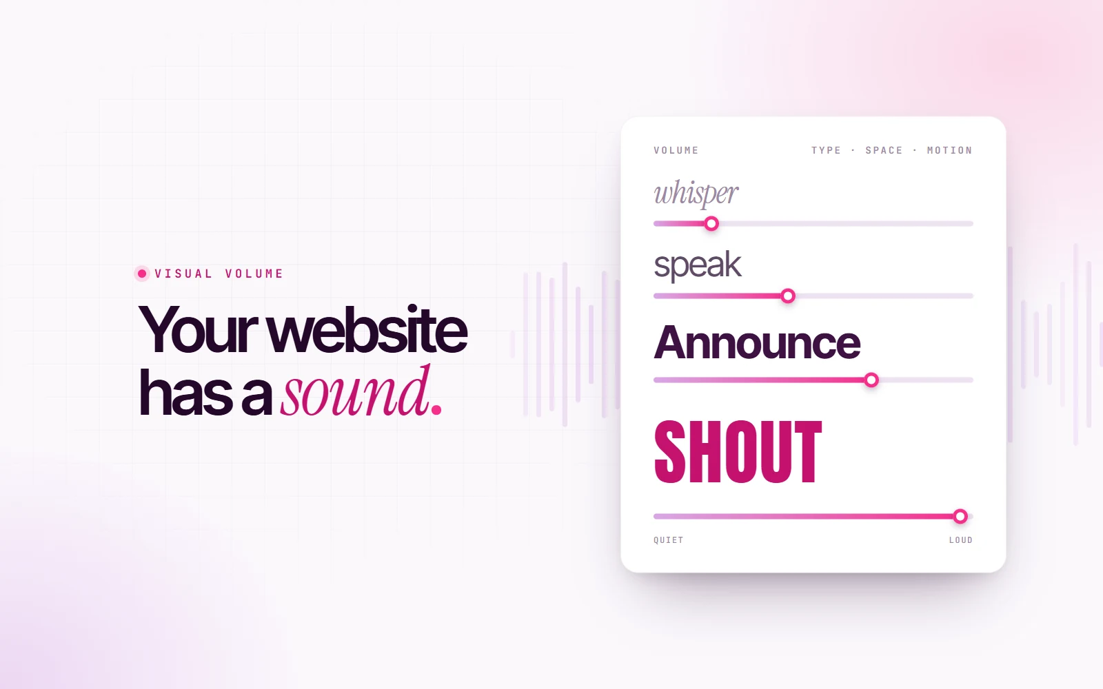
Tight, bold type shouts. An airy serif whispers. A bouncy animation giggles. Every website has a volume and a voice, and you're choosing it whether you mean to or not.
Close your eyes and think of a website you visited today. Now tell me: was it loud or quiet?
You probably have an answer. And yet no website you visited today made a sound. Nothing played, nothing beeped. Still, some sites feel like someone shouting a sale at you across a car park, and others feel like a quiet voice in a gallery.
That’s not a coincidence. Every interface has a visual volume, and it’s made of the same few things every time: type, space, color and motion. I spend a lot of my time with music (I built a whole app that turns moods into playlists), and the more I design, the more I think about websites the way a producer thinks about a mix.
Here’s what I mean.
Type is the voice
Type is the first thing that “speaks”, so it sets the volume before anything else.
- Weight is loudness. A heavy, black weight is a raised voice. A light weight is a soft one.
- Width is urgency. Condensed letters, squeezed tight together, feel fast and intense, like someone talking quickly. Wide letters feel relaxed and slow.
- Case is shouting. ALL CAPS IS SHOUTING, and everybody already knows it. That’s why it works so well for a festival poster and so badly for a terms of service.
- Serif or sans is accent. A modern sans feels direct and neutral. An italic serif feels personal, almost whispered, like a handwritten note.
When I designed the campaign for LAKE, a lakeside music festival, I wanted the headlines to sound like the crowd. So they’re set in Anton, a tall, heavy, condensed typeface, in capitals: FOUR DAYS. ONE LAKE. It’s the typographic version of a bass drop.
For VELOUR, a hi-fi listening bar, the brief was the opposite. People go there to listen quietly, so the brand speaks softly too: Gloock, an elegant display serif, with a single italic word in each headline and small, widely spaced labels. Same designer, same tools. Completely different volume.
Space is the room
If type is the voice, white space is the room the voice is in.
Put a lot of words close together with tight margins and the page feels like a crowded bar: everything is competing to be heard. Give the same words generous margins, air between lines and room to breathe, and it feels like a quiet room where every sentence lands.
This is why luxury brands use so much empty space. It’s not that they have nothing to say. Space is how they say it calmly and confidently, without needing to raise their voice. A discount store does the opposite: every inch is full, because full is loud, and loud is “act now”.
Neither is wrong. But you should choose it on purpose.
Color is the energy
I wrote a whole post on color psychology in UI, so I’ll keep this short. Saturation works like volume. Vivid, hot colors raise the energy of a page. Muted, cool colors lower it.
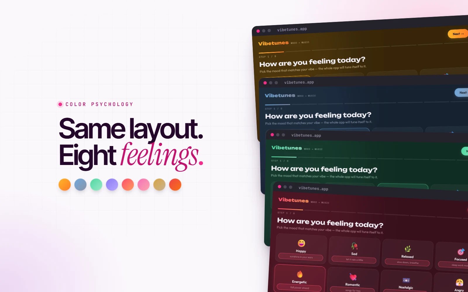
In Vibetunes, my mood-based music app, every mood has its own palette on the same layout. The energetic mood, hot pink into orange, feels loud before you’ve touched anything. The sad mood, muted blue, feels like someone speaking softly next to you. Same words. Different volume.
Motion is the rhythm
This is the one most people never think about, and it’s my favourite.
Animation has a tempo, and the easing curve is its rhythm:
- A bouncy, springy animation that overshoots and settles feels playful. It giggles.
- A slow ease-out, fast at the start and gently landing, feels calm and expensive. It exhales.
- A sharp, linear movement feels mechanical and efficient, like a metronome.
- Lots of things moving at once is noise, the visual version of everyone talking at the same time.
On my own site, almost everything moves on a long ease-out curve, with things settling into place rather than snapping. I wanted it to feel confident and calm, never hyper. If I’d used bouncy springs everywhere, the exact same layout would feel like a different, much younger brand.
Mix it like a song
A good music producer knows that if everything is loud, nothing is. The vocal sits on top, and everything else makes room for it.
Interfaces work the same way. The most common design problem I see isn’t an ugly color or a wrong font. It’s a page where everything is shouting: bold headline, bold buttons, bold badges, animated icons, three colors, all at full volume. Your eye doesn’t know where to go, so it goes nowhere.
The fix is to mix it:
- Pick one loud thing per screen. Usually the headline or the main call to action. Let it be the vocal.
- Turn everything else down. Lighter weights, softer colors, smaller sizes. They’re the backing track.
- Use silence on purpose. A bit of empty space right before your most important element makes it land harder, exactly like a pause before the chorus.
- Keep the tempo consistent. Pick one or two easing curves and use them everywhere. Mixed rhythms feel chaotic, even if nobody can say why.
How to find your website’s volume
Try this with your own site, or your next design:
- Describe it in three words as if it were a voice. Warm and quiet? Bright and fast? Calm and confident?
- Look at your type. Does its weight, width and case match those words?
- Look at your spacing. Is it a crowded room or a quiet one? Is that what you want?
- Watch your animations. Do they giggle, exhale or tick? Does that match the voice?
- Find the loudest thing on each screen. If you can’t, everything is too loud. If it isn’t the thing that matters most, swap them.
Your website is already talking to every visitor. It has a voice, a volume and a rhythm, whether you designed them or not.
So the only real question is: is it saying it the way you’d say it?