Loading Screens Are a Promise
Spinners, skeletons and storytelling. Why a well-designed wait can feel shorter than a fast but blank one, and how to design the seconds nobody wants to spend.
Nobody has ever said “what a lovely wait.”
And yet we all have a favourite one, even if we’ve never thought about it. The game that shows you tips while the level loads. The app whose little animation you secretly enjoy. And we all know the opposite too: the blank white screen where you start wondering whether you tapped the button at all.
Same seconds. Completely different feeling.
Here’s the thing I keep coming back to as both a designer and a developer: a loading screen is a promise. It tells people that something is happening, that it’s happening for them, and that it will be worth it. Keep that promise and the wait feels shorter. Break it and even a fast app feels broken.
Waiting is a feeling, not a number
There’s a classic idea from the psychology of queues: occupied time feels shorter than unoccupied time. It’s why airports put mirrors next to lifts and why restaurants hand you a menu while you wait for a table. The wait doesn’t get shorter. It just stops feeling like waiting.
Interfaces work the same way. A two-second wait with nothing on screen feels longer than a three-second wait where you can see progress. What people judge isn’t the stopwatch. It’s how uncertain they feel.
A useful rule of thumb from usability research:
- Under about a second, don’t show a loader at all. A flash of spinner just makes a fast thing feel slow.
- From one to around ten seconds, show that something is happening.
- Longer than that, show real progress, and ideally what’s happening, so people can decide whether to wait.
The three kinds of wait
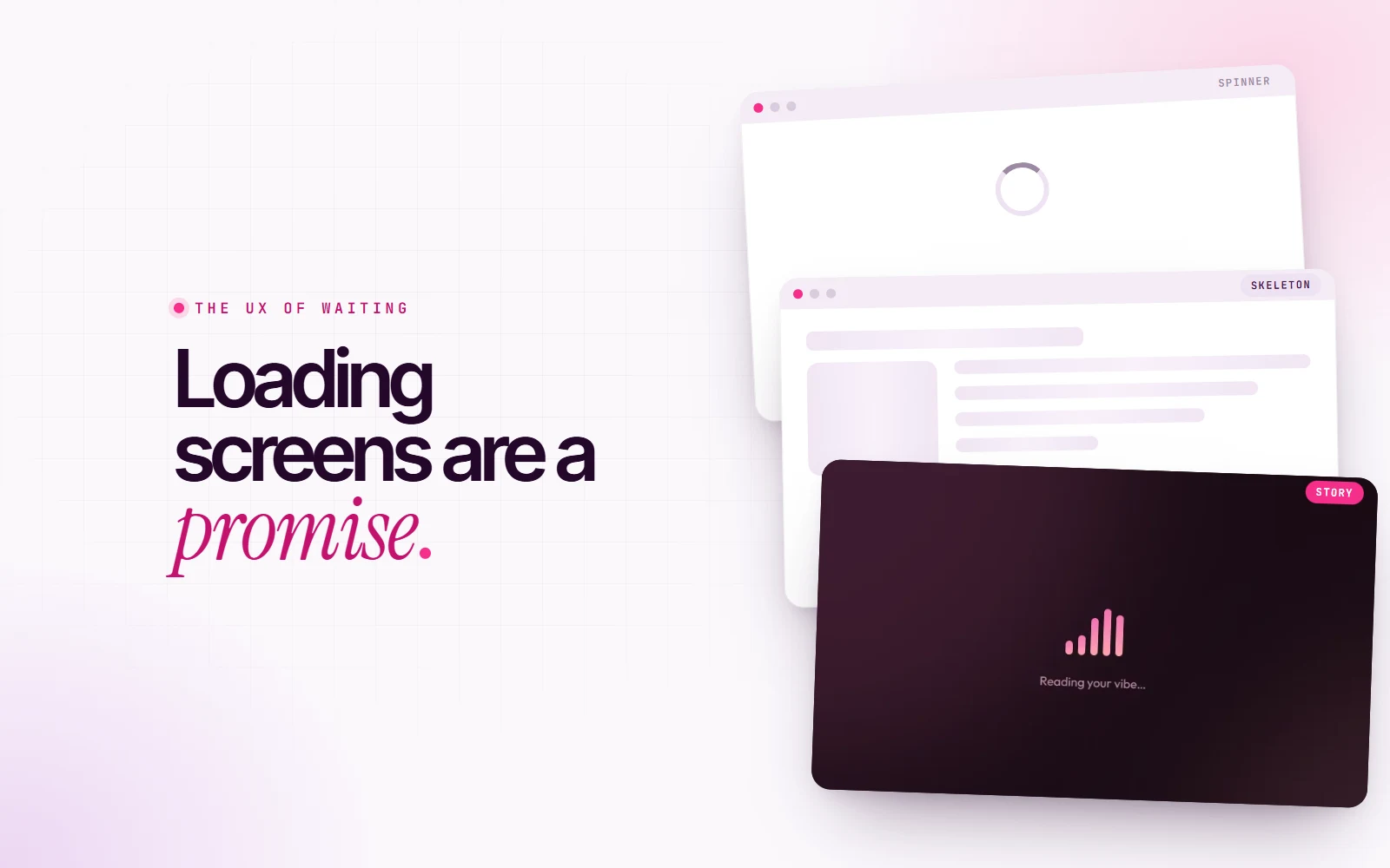
1. The spinner: “please hold”
The spinner is the hold music of the internet. It says “something is happening”, and that’s all it says. No progress, no idea how long, no idea what.
For short waits, that’s fine. For anything longer it becomes a little stressful, because a spinning circle looks exactly the same at second two as at second twenty. Is it working? Is it stuck? Should I refresh? Every spin adds a tiny bit of doubt.
2. The skeleton: “here’s what’s coming”
A skeleton screen shows the shape of the page before the content arrives: grey blocks where the headline, the image and the text will be. You’ll recognise it from almost every social app.
It works because it makes a promise you can see. Your brain starts reading the layout before the data lands, so when it arrives it feels like it filled in rather than appeared from nowhere. It’s honest, calm and quietly reassuring. For lists, feeds and dashboards, it’s usually the best choice.
3. The story: “here’s what I’m doing for you”
Sometimes the wait is long and the work is real, and that’s when you can turn the wait into part of the experience.
In Vibetunes, my mood-based music app, creating a playlist takes a few seconds. The app sends your answers to an AI curator, finds every song on Spotify and puts the playlist in order. That’s real work, and it takes real time.
So instead of a spinner, the loading screen tells you what’s happening, one step at a time:
Reading your vibe… Asking the AI curator for songs… Matching tracks on Spotify… Putting the playlist in order… Almost there, final touches…
Each message stays for a couple of seconds, while a small equalizer pulses in the colors of the mood you picked. It’s still a wait. But now it’s your playlist being made, and you can follow along. It feels less like a delay and more like watching someone cook your food.
When the wait is the welcome
My own website has a loading moment too: a paintbrush sweeps across the screen in three strokes, painting code and then my name, before the site opens. It’s the first thing people see, so it’s the first thing that tells them who I am. Design, then code, in one brushstroke.
But a branded intro is a promise with conditions, and I set myself a few rules:
- Keep it short. The whole animation takes under a second and a half.
- Show it once. It plays on your first visit, not every time you open a page.
- Respect people who don’t want motion. If someone has reduced motion turned on in their system settings, the intro is skipped entirely.
- Never trap anyone. There’s a safety timer, so the site always opens even if something goes wrong.
The moment an intro becomes something people have to sit through, it stops being a welcome and becomes a wall.
Make it accessible
A loader is also a message, so screen-reader users should get it too. In Vibetunes the loading screen is marked as a live status, which means a screen reader politely announces each new message (“Matching tracks on Spotify…”) instead of leaving the user in silence. It takes one attribute in the code, and it’s the difference between “the app froze” and “the app is working for me”.
How to design a better wait
- Measure first. If the wait is under a second, skip the loader.
- Use skeletons for content, like feeds, lists, cards and dashboards.
- Use stories for real work, like generating, uploading, processing and paying. Tell people what’s happening, in human words.
- Show progress when you can. A bar that moves beats a circle that spins.
- Make it on-brand, but short. Your loader can carry your personality, but it should never be the reason something feels slow.
- Don’t fake it. Never add a delay just to show off an animation. People notice, and the promise breaks.
- Make it speak. Announce loading states to screen readers.
The best loading screen isn’t the fastest one. It’s the one that makes the wait feel like it was worth it.
That’s the promise. Design it like you mean to keep it.
You can see the Vibetunes loading screen in action in the Vibetunes case study.